 "BiTurbo228 - Dr Frankenstein of Spitfires" (biturbo228)
06/28/2014 at 15:09 • Filed to: None
 0
0
 2
2
 "BiTurbo228 - Dr Frankenstein of Spitfires" (biturbo228)
06/28/2014 at 15:09 • Filed to: None |  0 0
|  2 2 |

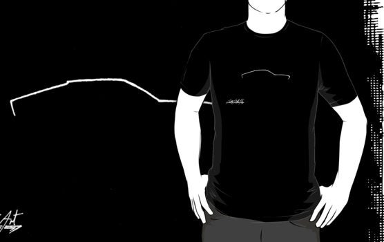
Does anyone have any ideas or criticisms? Currently I'm planning on doing black-on-light colours, red-on-white and some livery colours (maybe Gulf, Martini, Ferrari red/yellow and Lotus green/yellow). Page is !!!error: Indecipherable SUB-paragraph formatting!!! :)
!!! UNKNOWN CONTENT TYPE !!!
 Jobjoris
> BiTurbo228 - Dr Frankenstein of Spitfires
06/28/2014 at 17:17 |
|
Nice work. Ideas:
I don't get the Alpine A110. It looks more like a sharp-edged A310. But that wouldn't be correct as well as the back of the A310 first decends down sharper before returning forwards again if you know what I mean.
Also not sure if the 'signature' is somewhat to big in proportion (and therefor distracting) to the outline itself.
Also: As much as I love the 911, you're clearly missing out of a 2002! ;-)
 BiTurbo228 - Dr Frankenstein of Spitfires
> Jobjoris
06/29/2014 at 12:40 |
|
Yeah, it's odd how some of them turn out. That and the 240Z look really quite anonymous in silhouette. I think it must be the arches, or other details lower down the car that give them their character.
Ah, there's another to add to the list. I pretty much drew the cars that I really like and forgot that most of the ones people with normal taste really like aren't on there :S
I think you might be right about the signature, but it's an utter pain to go through each one I've uploaded and change things. I'll keep it in mind, and then when there are lots of changes to be made I'll just go through and do all of them.